


Live Ship Traffic Map: Complete Guide
A live ship traffic map is an interactive, real-time visualization of vessel positions across the world's oceans, ports, and inland waterways. It pulls data from AIS (Automatic Identification System) transponders aboard ships and displays each vessel as a clickable icon with speed, heading, destination, and identity details.
Open one for the first time and the scale is striking: tens of thousands of vessels visible simultaneously, streaming through the Strait of Malacca, queuing at Rotterdam, or crossing the North Atlantic in organized bands. The map doesn't just show where ships are; it reveals the structure of global maritime trade.
This guide covers how a live ship traffic map works, what all the data points mean, how to interpret the patterns you see, and which tools give you the clearest picture, whether you're tracking a loved one's cruise ship, monitoring a cargo shipment, or simply curious about how goods move across the planet.
What Is a Live Ship Traffic Map?
A live ship traffic map draws its data from AIS, the same collision-avoidance technology that ships use to broadcast their identity and position to nearby vessels. Every AIS-equipped ship transmits a VHF radio signal every 2 to 10 seconds, depending on its speed and navigation status.
Land-based receivers pick up these signals within roughly 40 to 100 km of the coast. Out in open ocean where no land station can reach, satellite receivers take over: orbital platforms that capture the same VHF signals from space and relay them to ground stations. The combination of terrestrial and satellite AIS means coverage extends to nearly all major shipping routes.
The scale of this system is substantial. Networks such as Kpler's platform process over 1.3 billion AIS signals daily, tracking more than 661,000 vessels at any given time. That data feeds into map platforms that refresh ship positions every few minutes, giving you a near real-time picture of global maritime traffic.
Not every ship appears on a live map. Vessels below a certain tonnage aren't required to carry AIS, and ships in sensitive regions may switch off their transponders deliberately. Most commercial vessels, passenger ships, and larger cargo carriers will show up reliably on any major tracking platform.
What a Live Ship Map Actually Shows
When you click a vessel icon, a data panel opens with more information than most first-time users expect. Understanding these data points turns a confusing stream of moving icons into something genuinely readable.
MMSI number (Maritime Mobile Service Identity) is a unique 9-digit identifier for each AIS transponder. Tracking platforms use it to distinguish one vessel from another, and you can search for a specific ship by entering it directly.
IMO number is assigned by the International Maritime Organization to ships above 300 gross tons. Unlike the MMSI, the IMO number stays with the ship permanently, even if the vessel changes name, flag, or owner. It's the most reliable way to track a ship's history across multiple voyages.
SOG (Speed Over Ground) is the ship's actual speed relative to the Earth's surface, measured in knots. This differs from the vessel's speed through the water because currents can accelerate or slow a ship considerably. If a ship normally cruises at 18 knots and its SOG reads 14, it's likely working against a headwind or adverse current.
COG (Course Over Ground) is the actual direction of travel over the seabed, accounting for drift from wind and currents. A ship's bow might point north while its COG reads northeast because the current is pushing it sideways. COG is what matters for predicting where the vessel will be next.
Heading is the compass direction the ship's bow points, measured in degrees from 0 to 359. On a live map, icons display a short line showing heading, while the COG arrow shows where the ship is actually going. The gap between the two reveals how much the vessel is being pushed off its intended course.
Navigation status codes tell you what the ship is doing at that moment. Code 0 means the vessel is under way using its engine; code 1 means at anchor; code 5 means moored. Other codes flag special conditions such as vessels restricted in their ability to maneuver. These status codes are among the most useful signals for anyone monitoring a ship's activity at a port.
Vessel icons on most platforms are color-coded by ship type. Cargo ships typically appear in blue or green, tankers in red, passenger ships in white or light blue, and high-speed craft in orange. This color system lets you scan the map quickly and understand the traffic composition at a glance.
How to Read a Live Ship Traffic Map
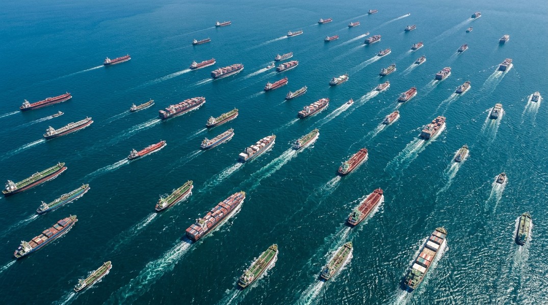
The first thing you notice on a live ship traffic map is density. Vessels cluster in predictable patterns, and those patterns tell a story about trade routes, port activity, and maritime regulation.
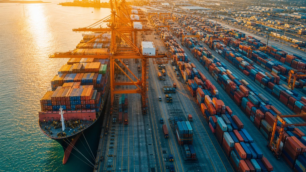
Dense bands of icons in the open ocean are shipping lanes, the maritime equivalent of motorway corridors. Near major ports like Singapore, Rotterdam, or Los Angeles, density spikes dramatically as ships arrive, depart, and anchor in waiting queues. Slow SOG readings clustered near a port entrance often signal congestion: ships waiting for berth availability, pilots, or weather clearance.
Zoom into a narrow strait like the English Channel and you'll notice two parallel streams of traffic moving in opposite directions. This is a Traffic Separation Scheme (TSS), one-way traffic lanes established by the IMO in busy coastal waters to reduce the risk of head-on collisions. Ships traveling east use one lane; westbound ships use the other. The separation is obvious on any live map.
To find a specific vessel, use the search function. Enter the ship name, MMSI, or IMO number. Once located, click the icon to open the full data panel. Many platforms draw the vessel's recent route as a dotted trail, showing where it has been over the past 24 to 48 hours.
Watch the heading indicator relative to COG over time. A significant and sustained difference between the two usually means the vessel is dealing with strong currents or wind. A sudden change in COG combined with a SOG drop can indicate a weather maneuver, an unplanned stop, or a course deviation worth noting, particularly relevant for cargo monitors keeping tabs on transit progress.
Major Shipping Lanes and Why They Cluster
The patterns on a live ship traffic map are not random. They follow routes shaped by geography, economics, and international agreement accumulated over decades.
The English Channel is the world's busiest shipping lane by traffic density. All vessels crossing between the Atlantic and Northern European ports pass through this narrow stretch of water between the UK and France. On a live map it looks like a river with two well-defined, opposing currents of icons.
The Strait of Malacca, between Malaysia and Indonesia, connects the Indian Ocean to the South China Sea and carries the bulk of trade between Europe, the Middle East, and East Asia. Roughly 40 percent of global seaborne trade passes through it annually, making it one of the most congested corridors visible on any live ship map.
The Suez Canal offers the most direct route between European ports and Asian markets, allowing ships to bypass the entire southern tip of Africa. The route is clearly visible on a live map as a thin vertical stream of vessels through the Red Sea, converging on the Canal entrance at Port Said.
The Strait of Hormuz handles a significant share of the world's seaborne oil exports from Gulf states. On a map you'll see a steady procession of large tankers moving through the narrow strait, their red icons distinguishing them from the mixed cargo traffic in neighboring corridors.
These chokepoints cluster because they're unavoidable: they're the shortest viable paths between major trading regions. Shipping lines optimize routes for fuel economy and transit time, so most vessels converge on the same handful of geographic gates. The open ocean between these lanes is often nearly empty by comparison. Traffic Separation Schemes make the clustering even more pronounced, channeling ships into defined corridors rather than letting them spread across the available water.
Using a Live Ship Map to Track Cruise Ships
Cruise ships are among the easiest vessels to track on a live map. They're large, reliably AIS-equipped, and follow published itineraries that correspond to the routes you can trace on screen.
To find a cruise ship, search by its name or browse the cruise line's fleet list. Most passenger vessels appear as white or light-colored icons, and their gross tonnage is typically visible in the data panel. The destination field usually matches the next port of call, and the ETA field shows the captain's reported arrival time.
The details worth watching go beyond just current position. Check the SOG: a ship maintaining its typical cruising speed is on schedule. A sustained slowdown mid-route can indicate weather conditions ahead, a planned speed reduction to hit a port tide window, or rarely, a mechanical issue. The navigation status code tells you whether the ship is under way, anchoring, or moored.
Ships sometimes disappear from live maps, and this understandably concerns families tracking a loved one. The most common causes are benign: terrestrial AIS receivers near busy ports can be overwhelmed by signal congestion, and satellite AIS updates less frequently in certain regions. A ship that vanishes from the map hasn't had an incident: the AIS signal isn't being received at that moment. Most platforms show the last known position with a timestamp so you know how recent the data is.
Primo Nautic addresses this gap by layering AI-generated context on top of the raw AIS feed. When a ship's position hasn't updated recently, the app explains why in plain language rather than leaving you staring at a frozen icon. For families tracking a loved one on a cruise, this kind of clarity matters considerably more than a raw data panel.
For a deeper look at the tools available for this use case, the guide to cruise ship location trackers covers the major options side by side.
Using a Live Ship Map for Cargo Shipments
For logistics teams and supply chain managers, a live ship map is a practical tool for monitoring cargo in transit. The goal isn't usually to watch a single vessel in real time but to track transit progress, detect delays early, and update delivery estimates before they become problems.
Start by searching the vessel carrying your cargo by name, IMO, or MMSI. The destination field shows where the ship is headed, and the ETA gives you the captain's reported arrival time. Compare the current COG to the expected route; a significant deviation is worth investigating, as it may indicate a weather reroute or an unscheduled port call.
Port congestion shows up clearly on a live map. A large cluster of cargo ships anchored near your destination port with low SOG readings is a visible early warning that berthing delays are likely. Platforms tracking historical data can tell you whether the current queue is typical for that port or an unusual spike.
Navigation status codes are particularly useful for cargo tracking. A ship showing status 1 (at anchor) near its destination for more than a few hours is waiting for a berth, a pilot, or weather clearance, all of which push your delivery timeline. Status 5 (moored) typically means the vessel is at berth and loading or unloading may be underway.
Primo Nautic takes cargo monitoring further with a dual ETA system that compares the captain's reported arrival time against a machine-calculated estimate based on the vessel's current speed, route, and conditions. When these two figures diverge significantly, the app flags it as a potential delay. For teams managing multiple shipments simultaneously, receiving a targeted alert is far more efficient than manually checking a live map for each vessel.
Best Live Ship Traffic Map Tools
Several platforms offer live ship tracking maps, from free web tools to professional maritime intelligence services. The right choice depends on what you're tracking and how much interpretation you need beyond raw position data.
MarineTraffic is the most widely used vessel tracking platform, operating one of the largest terrestrial AIS networks globally. Its free tier provides live vessel positions, basic data panels, and vessel search. Paid tiers add satellite AIS for remote ocean coverage, route prediction, port call history, and vessel alerts. You can explore the MarineTraffic live map directly to see the scope of its coverage. MarineTraffic suits maritime enthusiasts and professionals who want comprehensive data and are comfortable with a data-heavy interface.
VesselFinder covers more than 300,000 vessels daily on its live map with a reputation for accurate data and a clean interface. Features include voyage history, port call records, and fleet monitoring on paid plans. It appeals particularly to shipping professionals and maritime businesses focused on reliable fleet oversight.
Primo Nautic approaches vessel tracking from a different angle. Rather than presenting a map covered in raw fields, it adapts the AIS data based on your tracking purpose: following a cruise ship for a family member, monitoring a cargo shipment, or watching your own yacht. The free tier includes live AIS tracking, vessel search by name, MMSI, or IMO number, and live weather conditions at the vessel's exact location. A full overview of the current options appears in this comparison of vessel tracking apps across free and paid tiers.
Other tools serve more specific niches. Dedicated cruise tracking platforms focus solely on passenger ship itineraries with deck plan integrations. Enterprise maritime intelligence services process billions of daily AIS signals for commodity trade analysis, fleet performance benchmarking, and supply chain risk management.
| Tool | Best For | Free Tier | Notable Feature |
|---|---|---|---|
| MarineTraffic | Enthusiasts, professionals | Live map, vessel search | Largest AIS network |
| VesselFinder | Maritime businesses | Live positions, history | Fleet monitoring tools |
| Primo Nautic | Families, cargo monitors | AIS tracking, live weather | AI-personalized insights |
What to Look for When Choosing a Tool
Coverage and update frequency are the most important baseline factors. A platform that relies solely on terrestrial AIS will have gaps in the open ocean: fine for port monitoring, but problematic for tracking a trans-oceanic voyage. Check whether satellite AIS is included or available on the tiers you're considering.
Alert systems separate passive map viewers from active monitoring tools. The ability to receive a notification when a ship departs a port, arrives at its destination, updates its ETA, or deviates from its expected route removes the need to check manually. Look for platforms that let you configure alerts for specific vessels rather than just categories.
The interface matters for usability. A professional maritime intelligence platform may include every data field available, but if you're a cruise passenger's family member, navigating it is frustrating. Tools designed for general audiences present the same underlying AIS data in formats that require no maritime background to interpret correctly.
Mobile access is worth checking before committing to a platform. A live ship tracking map on your phone is practical when a vessel is approaching port and you want timely updates, when you want to share a position with someone else, or when you're monitoring a situation away from a desktop. Most major platforms offer iOS and Android apps alongside their web tools.
Finally, consider what the platform does with the data beyond displaying it. Raw AIS positions are useful; AI-calculated ETAs, plain-language voyage summaries, and purpose-adapted updates are more useful still for most people who aren't maritime professionals.
Conclusion
A live ship traffic map transforms a dense stream of radio signals into something anyone can read and use. The patterns visible on screen, from organized lane corridors to clusters at chokepoints and queues outside busy ports, are a direct reflection of how global trade actually moves.
Reading the map accurately means understanding the key data points: SOG versus COG, MMSI versus IMO, navigation status codes that tell you whether a ship is under way, waiting at anchor, or moored at berth. Once these building blocks make sense, the map becomes a practical tool rather than a decorative display of moving icons.
The best tool for you depends on what you're tracking. Professionals who need comprehensive data will find MarineTraffic or VesselFinder well-suited to their requirements. Families tracking cruise ships, cargo monitors following shipments, and anyone who wants answers rather than raw data fields will benefit from platforms that add interpretation to the live map layer.
Most Recent Posts
Discover more articles from our blog.